


In one of our recent articles, we introduced Tableau and how to start making visualizations. In this article, we will look at another popular BI and visualization tool called the QuickSight. QuickSight is Amazon’s tool for Data Analytics and is basically Amazon’s version of Tableau. This article will get you jump-started with AWS QuickSight.
Setting Up QuickSight
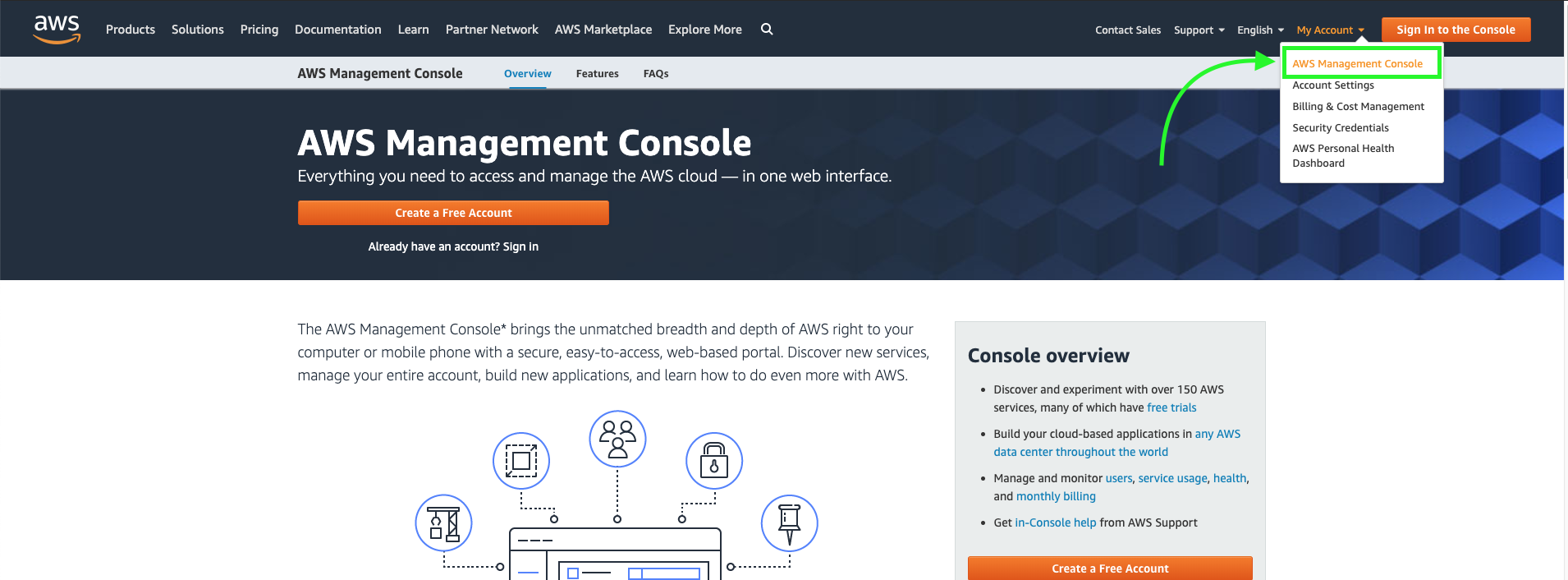
- Head to the AWS homepage and open your AWS management console from the My Account section
- Sign in to your AWS account with your credentials
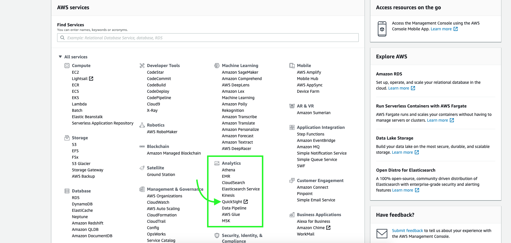
- Go to AWS services to list down all available services.Select QuickSight from the Analytics Section
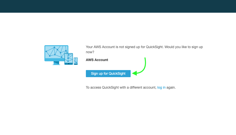
- If you have not used the service before you will be asked to Sign Up for the QuickSight service. Click the ‘Sign UP for QuickSight’ option to proceed.
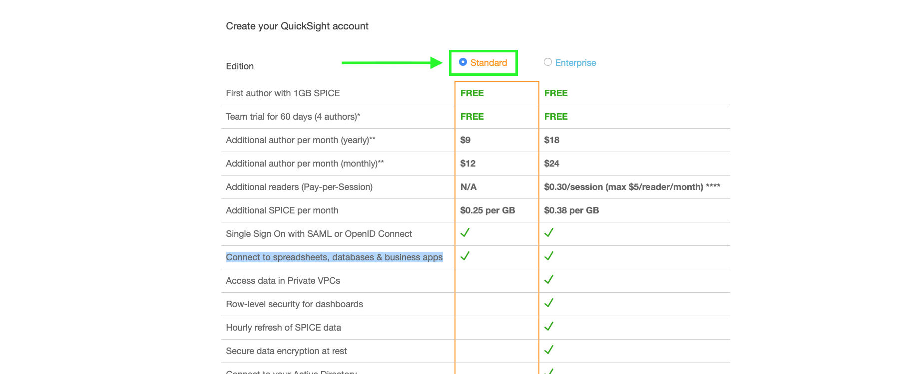
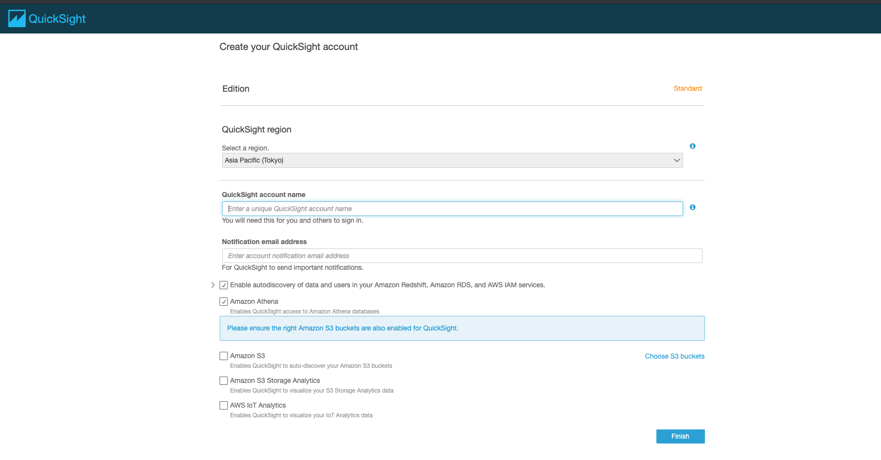
- Select the Standard version of QuickSight which comes free of cost and click continue
- On the upcoming page, you will be asked to set an account name and a notification email. Stick to the default values for the rest of the options. Fill in the details and click finish
- You will now be taken to QuickSights’s home page
Congrats! You have set up AWS QuickSight and it is all ready to be fired up.
Data Visualization with QuickSight
Importing the dataset
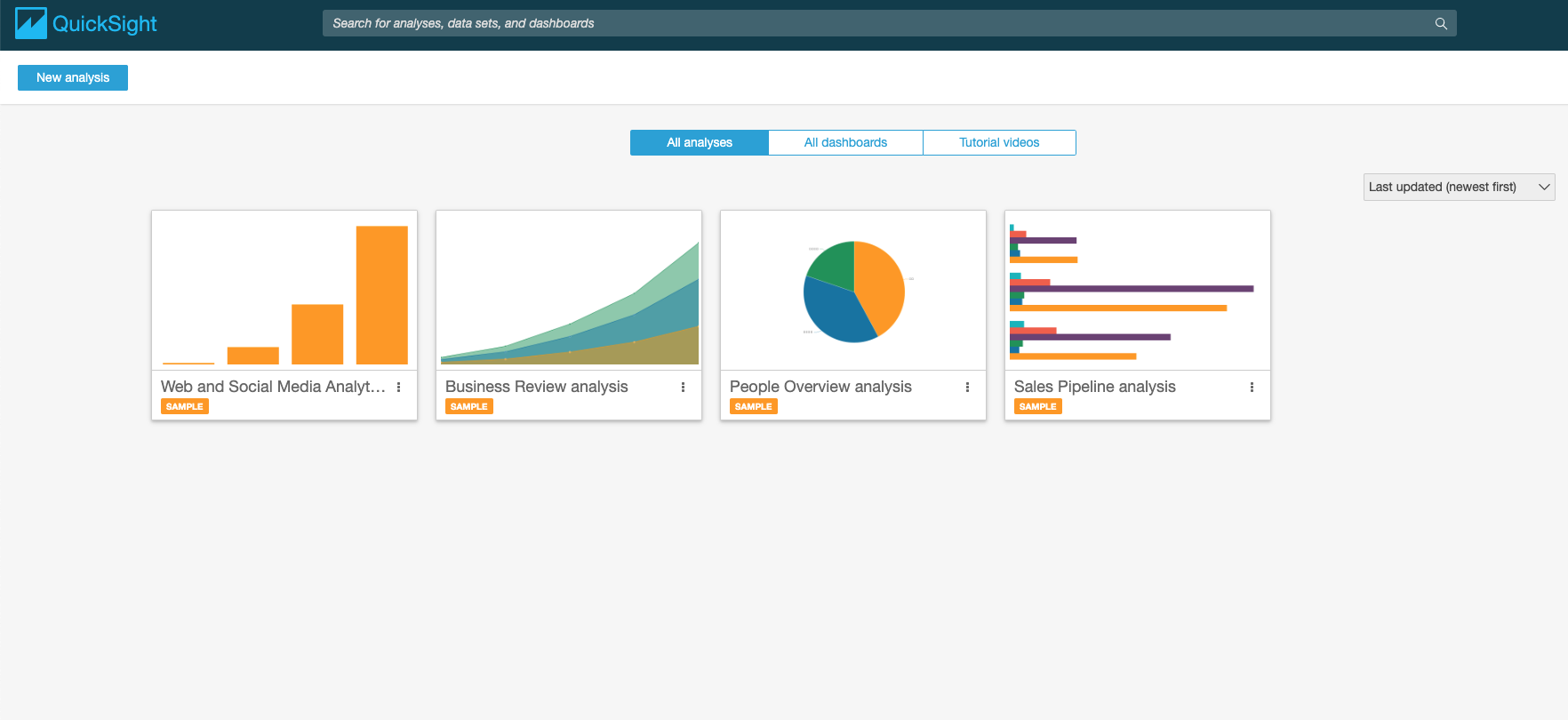
To import a new dataset, click on the ‘New Analysis’ button on the top left corner of QuickSight’s homepage. You will see a list of example datasets that can be imported from AWS S3. But here we will upload a new file from our local machine.
We will use the India State-wise Crimes 1987 dataset.Click here to download the dataset.
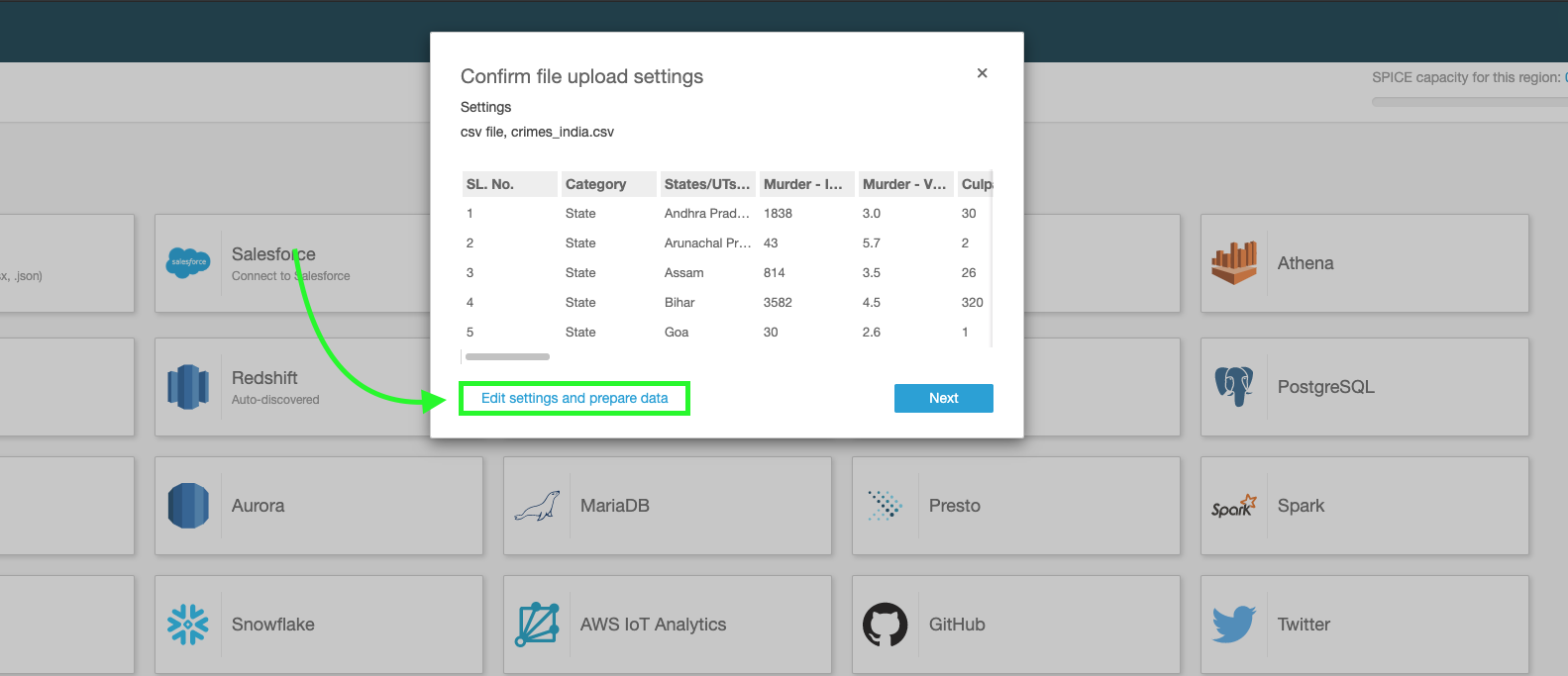
Click on the ‘New Dataset’ and on the upcoming menu select ‘Upload a new file’ option. Browse to the data file and select it to upload.

Once fully uploaded, we will see a short preview of the dataset with an option to edit or proceed to the visualization sheet. Click on the ‘Edit settings and prepare data’ button.
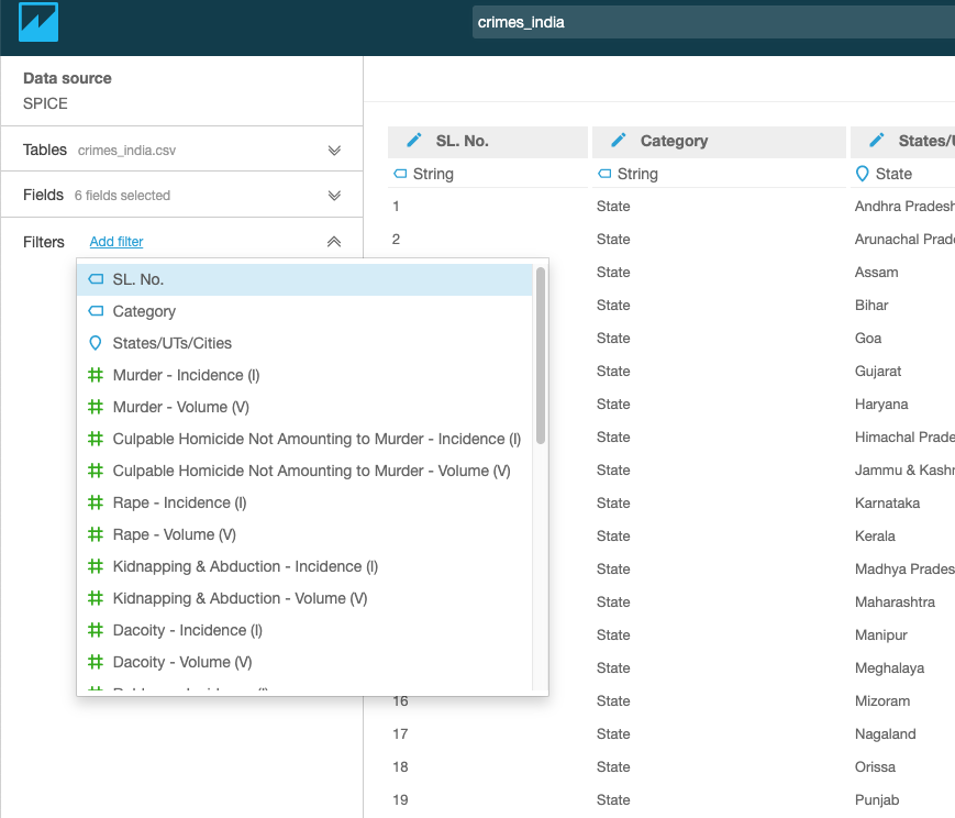
The dataset is now successfully imported and we will see a larger preview of the dataset. Note: what you see will be just a preview and you will not be able to see the entire dataset.
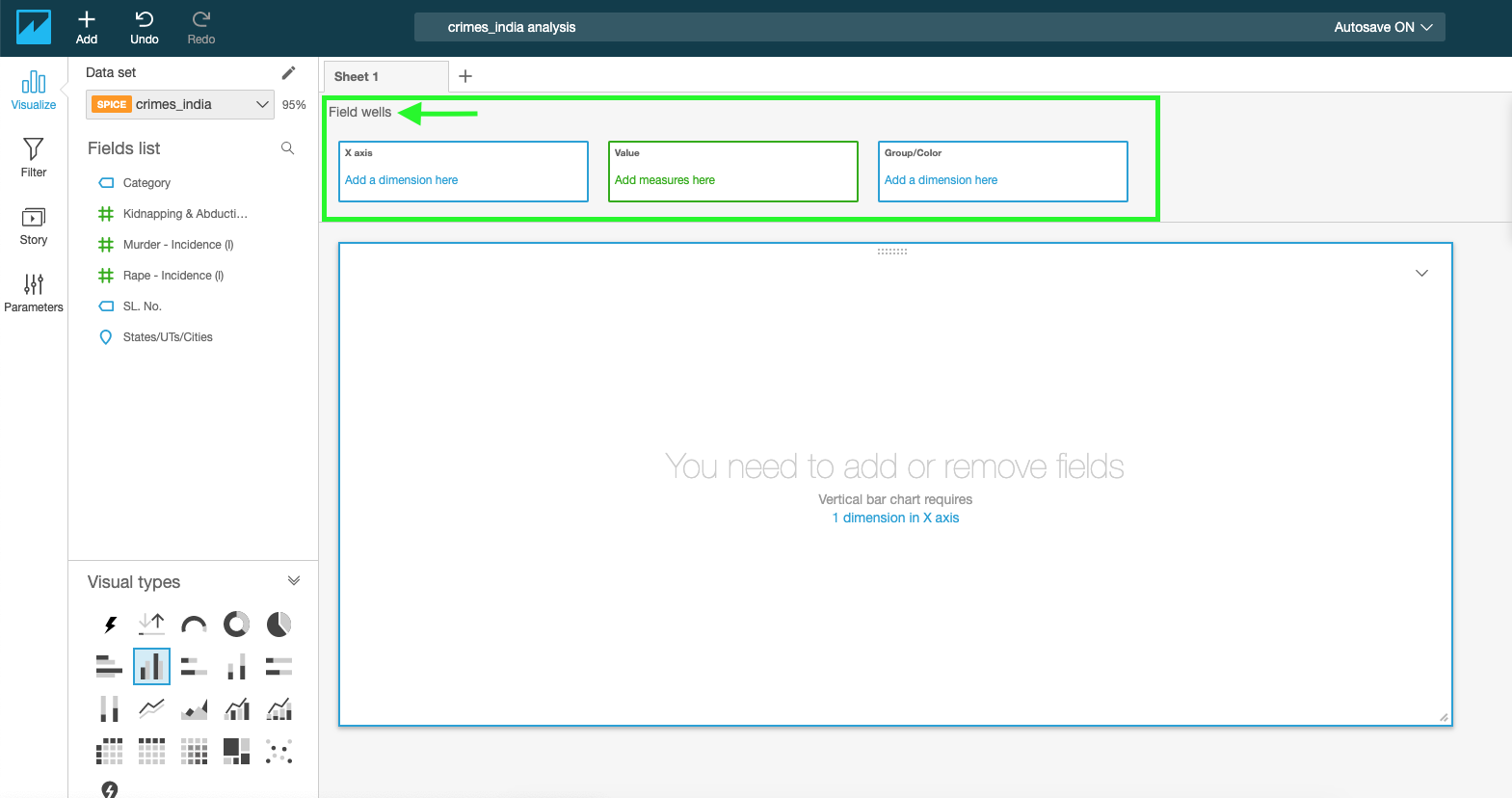
Now let’s focus on some important parts of the page. See the highlighted portions in the given image.

On the left side of the page, you’ll see 3 tabs namely – Tables, Fields and Filters.
Tables: Lets you see the list of connected tables.
Fields: List of features in the current dataset. The tab offers options to filter out specific columns from the dataset and also lets us create calculated or derived fields.
Filters: Lets you add filters to the dataset based on specific conditions.
Along with the column headers, you will see the datatype of the features that QuickSight automatically assigned. This can be edited by clicking on the data type and selecting from a list of available data types. QuickSight also allows us to rename the columns by clicking on the column name.
Data Preparation
Selecting Specific Columns
Click on the Fields tab and tick the checkboxes of the fields you wish to select for visualization.

Changing the data type of a column
Change the data type of States/UTs/Cities column from String to State.

Adding a filter
Add a filter to remove the aggregated values (State-wise/UT-Wise/City-wise/All_india Sum) from the dataset. Select the Filter tab and click on the Add Filter option. Select a column to apply the filter to. In this case, select SL.No. Click on the added filter to edit it.
Edit the filter to add a custom filter that shows all rows except the ones that contain the word ‘Total’ in the SL.No column. See the below image.
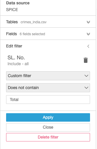
Click on apply and the dataset will be refreshed. You will see that all the cells with the word Total have been removed.
Now we are ready to visualize the data.
Data Visualization
Click on the save and visualize button on top to move to the visualization worksheet.

Let’s do some simple visualizations with the selected fields of the data.
Bar Chart: Plotting State/UT/City – Wise Murder Incidence count
Step1. Click on the horizontal bar chart from the Visual Types tab. Click on the ‘Field Wells’ tab to expand the axis and colour options for the plot.
Step2. Drag and drop the States/UTs/Cities column into the X-axis box.
Step3. Drag the murder incidence column into the value box.

Note:
To change the aggregation method for a measure, click on the drop-down and change the aggregate from the sum to any of the listed methods. See the image below.

TreeMap: Plotting State Wise KIdnapping & Abduction Incidence count
Step1. Add a filter to include only States from the category feature
Step2. Select the TreeMap plot from the Visual Types tab.
Step3. Drag and drop the States/UTs/Cities column into the ‘Group by’ box.
Step4. Drag the Kidnapping and Abduction Incidence column into the ‘Size’ box.
Note: You can also add colour by dragging a feature into the ‘Color’ box.

Try and experiment with different types of plots until you find one that is both beautiful and insightful.
All the visualizations you create will be saved automatically in the QuickSite workspace.
Closing Note
QuickSight lets us visualize data with a variety of plots. Although some of the features may not be on par with what Tableau has to offer, QuickSight’s popularity comes from its affordable pricing. QuickSight is very cheaper compared to Tableau and also comes with an option to pay per usage.