One of the coolest and creative things about Data Science is visualization. It is where we put our technical skills to work in correlation with art. Data visualization is not an easy task but is an enjoyable task where we get to turn raw and unattractive data into bright and colourful images that can even move and interact.
Geographical plots are the same, they are beautiful and when done right, highly informational. Choropleth maps or maps that use colours to distinguish different regions based on certain factors have been in use for centuries. Today it plays a vital role in Data Analysis and is a major part of almost any research dashboards that has nationwide or worldwide data to expose.
In this article, we shall learn how to create geographical plots with colourful maps using plotly. If you are new to plotly check out our article on how to begin with plotly here.
Geographical plotting With Plotly
Importing the libraries
We will start by importing all the modules necessary to create our visualizations offline.
import plotly.plotly as pl
import plotly.graph_objs as gobj
import pandas as pd
from plotly.offline import download_plotlyjs,init_notebook_mode,plot,iplot
init_notebook_mode(connected=True)
Plotting The Neighbours
We will use Plotly’s geographical map to plot India and its neighbours on a choropleth map. The map is plotted using Plotly’s graph_objs module that we imported. It requires two important parameters that have to be passed as arguments, data and layout.
Each of these parameters consists of a dictionary of parameters and arguments that are referenced by the module. Let’s understand what that means.
We start by initialising the data and layout variables which are a dictionary of parameters and arguments that are required by the graph_objs.Figure class to plot the maps. We then create an object for the graph_objs.Figure class by passing the initialized variables data and layout as arguments. Finally, we plot the graph using the plot method.
To plot India and its neighbours, we will use the following code blocks.
#initializing the data variable
data = dict(type = 'choropleth',
locations = ['india','nepal','china','pakistan','Bangladesh','bhutan','myanmar','srilanka'],
locationmode = 'country names',
colorscale= 'Portland',
text= ['IND','NEP','CHI','PAK','BAN','BHU', 'MYN','SLK'],
z=[1.0,2.0,3.0,4.0,5.0,6.0,7.0,8.0],
colorbar = {'title':'Country Colours', 'len':200,'lenmode':'pixels' })
- type : ‘choropleth’ specifies that we are plotting a choropleth map.
- locations : The names of countries we want to plot.
- locationmode : It specifies that the plotting level is country wise. The value can be one of 3,-“ISO-3” , “USA-states” , “country names”.
- colorscale : The colour set used to plot the map.Available color scales are ‘Greys’, ‘YlGnBu’, ‘Greens’, ‘YlOrRd’, ‘Bluered’, ‘RdBu’, ‘Reds’, ‘Blues’, ‘Picnic’, ‘Rainbow’, ‘Portland’, ‘Jet’, ‘Hot’, ‘Blackbody’, ‘Earth’, ‘Electric’, ‘Viridis’, ‘Cividis’
- text: The textual information that needs to be displayed for each country on hover.
- z: The value or factor that is used to distinguish the countries. These values are used by the colour scale.
- colorbar: A dictionary of parameters and arguments to customize the display of colorbar.Used to control the properties of the colorbar such as length, title, axis etc.
#initializing the layout variable
layout = dict(geo = {'scope':'asia'})
- geo: The parameter sets the properties of the map layout. The scope parameter sets the scope of the map. Scope can have any of the 7 values- “world” | “usa” | “europe” | “asia” | “africa” | “north america” | “south america” .
# Initializing the Figure object by passing data and layout as arguments.
col_map = gobj.Figure(data = [data],layout = layout)
#plotting the map
iplot(col_map)

Comparing India’s Population With Its Neighbours
Now that we know how to create a basic choropleth, we will use that knowledge on a real-world dataset.
Go ahead and download the world population dataset by clicking here. Extract the zip file and rename the main data file which contains the year wise population data of all the countries.
Here I have renamed the file as population.csv.
Let’s get going!
Step 1: Load the dataset and prepare it to fit the problem statement
We are trying to plot only the population of India and its neighbours for the year 2018, So lets extract that information from the dataset.
#Reading the dataset
pop = pd.read_csv('population.csv')
#Selected columns from the complete dataset
cols = ['Country Name','2018']
#Countries that we require the data of
countries = ['India','Pakistan','China','Bangladesh','Nepal','Bhutan','Myanmar','Sri Lanka']
#Overwriting the data with only details of countries we need.
new_pop = pop[cols][pop['Country Name'].isin(countries)]
Let’s have a look at the new data:

Step 2: Plotting on the map
#Initializing the data variable
data = dict(type = 'choropleth',
locations = new_pop['Country Name'],
locationmode = 'country names',
autocolorscale = False,
colorscale = 'RdBu',
text= new_pop['Country Name'],
z=new_pop['2018'],
marker = dict(line = dict(color = 'rgb(255,255,255)',width = 1)),
colorbar = {'title':'Colorbar Title','len':0.25,'lenmode':'fraction'})
Here we pass the data to the map directly from the data frame. For example, we set the locations by passing the pandas.series (pop[‘Country Name’]). Similarly, we pass the values that compare the countries (population in the year 2018) as a pandas series.
The two additional parameters autoscale and marker perform the following functionalities.
- autoscale: If set to true ignores the colour-scale parameter and chooses the default colour-scale to plot the map
- marker: controls the properties of the boundaries of location modes. In the above example, it sets a white boundary line of width 1 to separate all the countries portrayed in the map.
#Initializing the layout variable
layout = dict(geo = dict(scope='asia'))
#Initializing the object for graph_objs.Figure class
asiamap = gobj.Figure(data = [data],layout = layout)
#plotting the map
iplot(asiamap)

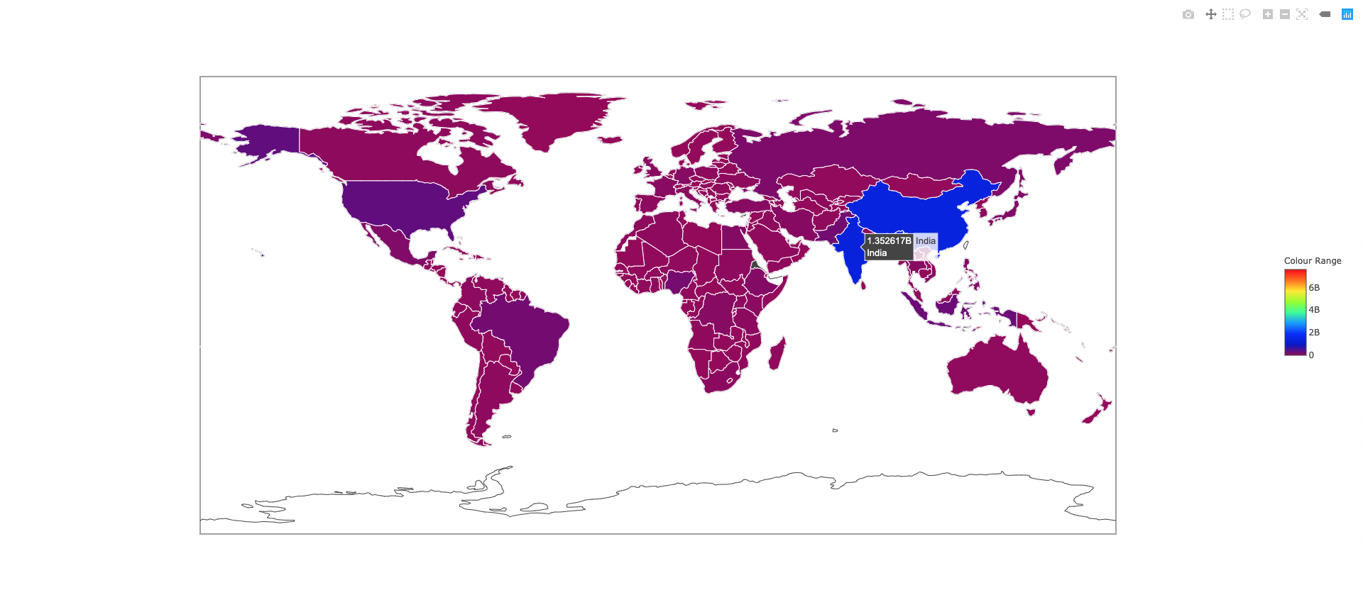
World Population 2018
Now let’s try to plot the entire world population in the year 2018. We will follow the same steps as we did above except this time we will not filter specific countries.
Step 1: Load the dataset and prepare it to fit the problem statement
pop = pd.read_csv('population.csv')
cols = ['Country Name','2018']
new = pop[cols]
Step 2: Plotting on the map
data = dict(type = 'choropleth',
locations = new['Country Name'],
locationmode = 'country names',
autocolorscale = False,
colorscale = 'Rainbow',
text= new['Country Name'],
z=new['2018'],
marker = dict(line = dict(color = 'rgb(255,255,255)',width = 1)),
colorbar = {'title':'Colour Range','len':0.25,'lenmode':'fraction'})
layout = dict(geo = dict(scope='world'))
worldmap = gobj.Figure(data = [data3],layout = layout3)
plot(worldmap)
The plot method opens up the plot in a browser window which can be saved as an html document.
Great! Now you can plot any data using choropleth maps with plotly !!