


There is nothing more powerful than a beautiful visualization. The effect of an intuitive visualization is far more satisfying than looking at a large table of data. In a previous article, we learned to plot graphs and create beautiful visualizations on-the-go with the Pandas built-in library. Pandas plot is a very handy feature when it comes to visualizing data frames however, it can not be compared to the dedicated plotting or visualization libraries that are available in python.
In this article will learn to implement a powerful visualization tool in python called seaborn.
Before we begin, make sure to check out MachineHack’s latest hackathon- Predicting The Costs Of Used Cars – Hackathon By Imarticus Learning. Click here to participate and win exciting prizes.
Introduction To Seaborn
Like Pandas plot, Seaborn is also a visualization library for making statistical graphics in Python that is more adapted for efficient use with the pandas’ data frames. Seaborn is built on top of matplotlib.
The library provides a lot of flexibility when it comes to plotting from data frames allowing users to choose from a wide range of plotting styles while mapping the set of features from the data efficiently.
Installing Seaborn
To install Seaborn type the following command in your terminal or command prompt:
pip install seaborn
Note:
If you are installing into virtual environment make sure to activate it. Run <code>conda activate</code> in case you are installing into a conda environment.
Plotting With Seaborn
Seaborn comes with a handful of example data sets to help users learn. In this article, we will use one such simple example dataset to plot different types of graphs.
Importing the library
import seaborn as sns
Loading the dataset
tips = sns.load_dataset('tips')
The tips data set is a simple dataset that consists of observations on tip providers in restaurants. The data consists of the following features :
- total_bill: The total bill paid by the customer.
- tip: The tip provided by the customer.
- sex: The gender of the customer.
- smoker: If the customer is a smoker or not.
- day: The day of the week when the observation was made.
- time: The time of the observation, whether at lunch or dinner etc.
- size: The size of the group whether there were multiple members.
Here is what the dataset looks like:

Some Simple Plots With Seaborn
Scatter Plot:
Scatter plots simply plot the data points specified along the axis on a two-dimensional plane.
sns.scatterplot(x="total_bill", y="tip", data=tips)
Here we pass the x-axis as total-bill, y-axis as a tip and the data frame tips.
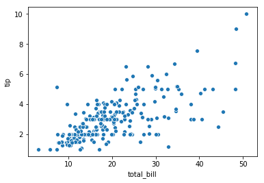
From the above scatter plot, we can see that as the total_bill increases the tip is also expected to increase.
Line Plot:
To plot a simple line plot, we use the lineplot method as shown below. We will plot a line between the size and tips.
sns.lineplot(x="size", y="tip",data=tips)
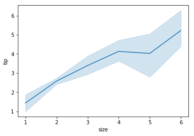
In this case, clearly, the tip increases with the increase in the size.
Dist Plot:
The dist plot or distribution plot plots the occurrences or density of the specified feature in the dataset. Lets us plot the distribution of tips from the dataset.
sns.distplot(tips['tip'])
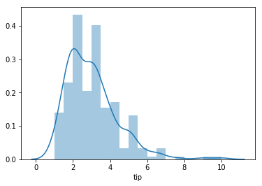
From the image above we can see that most of the tips given by the customers lie between the range of 2 and 4.
Bar Plot:
We will now use a bar plot to visualize which days brought in the highest tip from the customers.
sns.barplot(x="day", y="tip", data = tips)

From the plot, it is clear that the highest tip was received on Sunday.
Kernel Density Plot:
Like histograms, KDE or kernel density or simply, density plot visualizes the distribution of data over a continuous interval or time period.The peaks of a Density Plot displays where exactly the values are concentrated over the interval. Let us plot the density distribution of tips.
sns.kdeplot(tips['tip'])
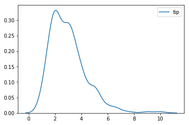
Like we saw in the distribution plot we see that most of the tips are between the range of 2 and 4.
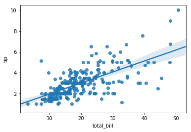
Reg Plot :
Regression plot is one of the key plots available in seaborn. It plots the data points and also draws a regression line.
sns.regplot(x="total_bill", y="tip", data=tips)
Box Plot :
Box plots are very useful plots that can covey multiple information at a time. It conveys the distribution of values, the maximum and median values. Let us box plot size vs tips.
sns.boxplot(x="size", y="tip", data = tips)
sns.boxplot(x="size", y="tip", data = tips)“>
Each box represents a size group in the dataset. The median value of tip by each size is represented by the horizontal line within the box.
Cat Plot :
The categorical plot shows the relationship between a numerical and one or more categorical variables in the data. Let’s look at the categorical plot between tip and smoker.
sns.catplot(x="smoker", y="tip", data = tips)

Joint Plot :
The joint plot allows us to draw a plot of two variables with bivariate and univariate graphs. We can also specify the kind of plots with the ‘kind’ keyword argument.Kind must be either ‘scatter’, ‘reg’, ‘resid’, ‘kde’, or ‘hex’.
sns.jointplot(x='total_bill',y='tip',data=tips,kind='reg')

The above plot image shows a regression plot between tip and total_bill and also compares the density distribution of the two variables.
Count Plot :
Count plot lets us easily plot a feature against the number of observations or occurances.
Lets us visualize the number of smokers and non-smokers in the dataset.
sns.countplot(x='smoker',data=tips)

Pair Plot:
One of the simplest ways to visualize the relation between all features, the pair plot method plots all the pair relationships in the dataset at once.
sns.pairplot(tips)

The method takes all the features in the dataset and plots it against each other.
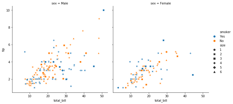
Relational Plot :
The relplot function provides access to several different axes-level functions that show the relationship between any two variables with semantic mappings of subsets.
Let us plot the relation between tip and total bill for each gender, smoker and size.
sns.relplot(x="total_bill", y="tip", col="sex",
hue="smoker", style="size",
data=tips)
- col: The feature to be visualized in subplots column.
- hue: The feature to be represented or distinguished with different colours.
- style: The feature to be represented or distinguished with different styles.
- size: The feature to be represented or distinguished with different sizes of markers.
Heat Map:
Heat maps are very useful and intuitive plots when we have a matrix of data. Let us consider the correlation values of the tips dataset to plot a heat map.
sns.heatmap(tips.corr(),linecolor='white',linewidths=2,annot=True)
- cmap: This argument allows to select a colour map for the plot.
- linecolor: This argument allows to set a colour to the margin separating each block in a heatmap.
- linewidths: This argument allows to set the margin width of a block.
- annot: Allows to specify the value in each block of the heatmap

These are some of the simplest plots that can be created using seaborn. Seaborn can be used to create much more complicated, beautiful and intuitive graphs as you can see in the seaborns official gallery.