As soon as the election results had begun its counts, Tweeples began to make live updates in forms of interesting visualizations. This is an interesting way of clipping together data with election results and providing insightful information. According to the latest trends, the BJP-led NDA has crossed the majority mark with 350 seats out of the total 542 Lok Sabha seats.
The NDA-II is expected to frame policies and drive programs to help Indian MSMEs and start-ups, take their rightful position in the global economy. The policies should encourage new age businesses to be set up and should remove business irritants.
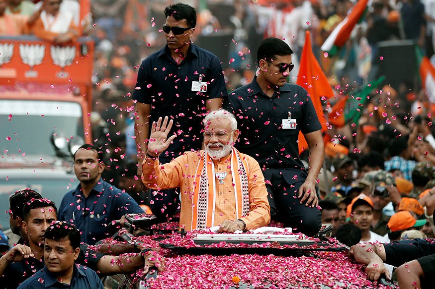
After being voted in with a fantastic margin, Modi tweeted: ‘Together we will grow, together we will prospe. Together we will build a strong and inclusive India.’ The Prime Minister of Israel, Benjamin Netanyahu, on Twitter tweeted:
https://twitter.com/netanyahu/status/1131479880934334465
Here are the top 5 visualisation that summarized the General Elections 2019 and the saffron wave behind it:
1.Frequently used Hashtags for BJP and Congress:

This visualisation shows the most frequent hashtags linked to the BJP an the Congress in a bar graph. The most popular hashtag in case of the BJP is “#nyay” followed by “#nda”. NYAY is Nyuntam Aay Yojana, the Minimum Income Guarantee Scheme for five crore poorest families, promised by the Congress Party in their 2019 election manifesto. In case of the Congress, the most frequently used hashtags are “#upa” and “#bjp”.
2.Visualisation and analysis for different states:
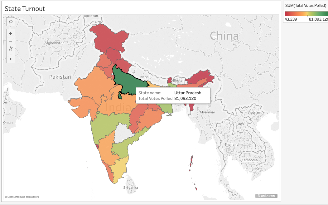

Aniket Garg from LinkedIn had made visualisations of the 2014 Lok Sabha elections which he updated with the current 2019 exit polls on his LinkedIn account using analytics. With the dataset that he got, he updated that maximum number of candidates were of age 57, Uttar Pradesh had the highest number of voters and the oldest candidates were from Mizoram with average age of 65.67. He did the analysis on Tableau. Here is the link to his post on his LinkedIn account.
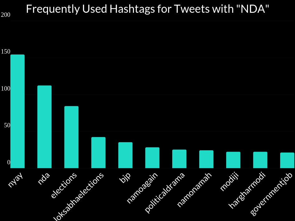
3.Number of Tweets for NDA and UPA:
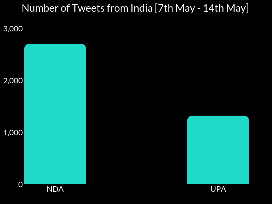
The bar chart represents the number of tweets talking about NDA and UPA on Twitter. The number of people talking about NDA outranks UPA by almost 100%. This link is from Prompt Cloud.
4.Map distribution:

This is a live status update of the election vote counts by Maps of India. The map shows the distribution of different parties across the country. The Bharatiya Janata Party dominated most if the states. You can find the live update here.
5. Candidates by Education:

This is a graph by Gramener. This visualisation shows the education of the candidates for election. According to the analysis, graduates and post graduates form 1/3rd of the total candidates (35%) and 14% candidates are only 10th pass.

![[Exclusive] Meet the AI Advisor of Prime Minister Narendra Modi](https://analyticsindiamag.com/wp-content/uploads/2024/01/Amit-Sheth-on-Making-India-the-AI-Hub-of-the-World--768x432.jpg.webp)